Saturday, 9 April 2016

Prince of Persia Sands of Time - World Design

The cinematic introduction to the game sets up the time period and which part of the world the player is in. The narrative further accomplishes this with the use of dialogue while the cinematic plays. The architecture we as the player see is clearly influenced in this part by Indian architecture, during a conversation between the king and the man whom signalled the kings men to attack, we hear him say "the maharajah treasures are hidden within". The context in what he says further extends on the fact this is taking place within India somewhere. Not long after this we are given control of the player, these first couple of levels are a tutorial of how the game is to be played, and gives the player insight into the main mechanics such as wall running, jumping and how to navigate the obstacles. When the player has a moment where it seems like a flashback the game is showing the player exactly what they have to do to be able to advance to the next portion of the stage. From playing the first couple of levels in the demo I found that the game tries to teach you very early on that time will be important when it comes to make jumps from walls runs or jumps in general. For example the very first time it gets you to wall run you must wall run at the very peak of the ledge in order to make it to the other side with a wall run. Unless you can complete this you will not go further in the level. The architecture leans itself towards the way the game plays as well, it contextualises where the player currently is but also makes sense for how and where the player navigates within the level. 

Thirsty?


Another part of the game I found interesting was the idea of water replenishing your health, being in a desert water is the epitome of life, I appreciated the symbolism in its use to replenish the players health. The beginning of the game show cased the games core movement mechanics as well as core game play mechanics like the use of the time dagger. It doesn't wait to show the player as well to what it can do, as soon as the player picks up the dagger, the next cut-scene shows you the kind of power it has. I thought this was well placed as it was a brief moment and was not dragged out. The game goes on to lead you through a tutorial and how the battle system works, it is here that much more importance is placed on the time dagger. The battle mechanic with the time dagger goes hand in hand with its ability to be able to rewind time. The way the game handles this mechanic is great as it displays that even though the time dagger is powerful it still needs something quantifiable to be able to use it regularly. We are also shown that the dagger not only rewinds time but also gives the ability to slow enemies down. From what I have played the narrative of the game has come before the game play, my reasoning for this is that everything that the player is able to do is contextualised by the game world rather than the mechanics themselves contextualizing the world around it. This could not be more clear as to when you pick up the dagger for the first time, the player is not in control of the first rewind rather the time rewind function of the dagger is in control of the player.

Reference for Images
Image 1 http://i.imgur.com/cgc1W.png
Image 2 http://static1.gamespot.com/uploads/scale_super/gamespot/images/2003/reviews/540893-589721_20031209_003.jpg
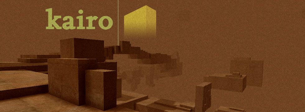

Kairo - World Design


The game begins with a lot of negative space, at first when I went to talk off the first platform I thought will I fall? will this cause my character to die? However this does not happen when I walk off the first platform it feels somewhat strange as most games have something for the player to stand on looking back at the platform with nothing below my feet felt other worldly. This other worldly feeling is helped on by the sound in the game, it's like putting your ear to a seashell and hearing the sea. It gives that chilling but at the same time soothing ambience. Upon inspection of the 2nd platform there is a door to go through. Now in a room, the space is vastly different to the endless abyss of where I had just come from. The space in the room feels small and somewhat just as daunting as the endless abyss outside. Inside there is a chair that with a symbol on it, the wall behind the chair also bears the same symbol upon pushing the two together it opens up the door below which you can then go through. This time this port is different from the one to the current room you're in. The first room had no indication of what you would be walking into however this room has a blurred image of the puzzle you are about to walk into. The arrangement of the cubes around the levels seem to be placed exactly where they need to be. When walking through there are shrine like objects that lead the player forward. The bridge to the next platform is raised, at first this confused me a little bit however remembering that the bridge went up when I walked under a different portion of the stage I was on gave me the idea that maybe walking over it would lower the bridge and it did do that. This was a clever trigger to have placed within the level, it was not to complicated but made sense to be the same trigger to bring the bridge back down. Another puzzle I thought was interesting within this game was the puzzle using the beams of light, it was interesting as to the simplicity of how it was laid out. using the beams of light to connect up, then using the piece of rubble to stop one of the lights so it would line up correctly was a great touch. At first I did not think it was possible as majority of the levels so far have shown little to no interaction with the objects around you. The beam of light triggered here is then seen throughout the other levels of the game. This game is very event driven and finding the visual cues is key to completing it.  The level layout is doesn't try to convince me to go to certain places but uses verticality to try and show the player where they should be heading. From the levels I have played going up is normally the right choice when the player is surrounded by negative space. Generally a big object will be in the distance to which the player will have to go to. To change this up on the odd occasion if you walk into a room you will be on top and having to go down but these portions are a lot smaller and less grand than the going up portions. A portion of the level where the negative space is coloured red it coaxes the player to go up, and just before it hits the point where the player should go it tries to change the pace by making the player feel too heavy to get to the top. At the top the player is then greeted by what seems to be images of destruction of homes and nature. In the background you can hear strange noises and seems to sound like a broken record. The colour red is for danger combined with the imagery seen its like the creator of this game is trying to warn the player against something. The games simple design serves it well to serve up its core mechanics of exploration and puzzle solving.

Reference for Images
Image 1
http://www.gry-online.pl/i/h/4/1735075312.jpg

Invisible Walls Bioshock - A critical world design view of the beginning to Bioshock

The game starts off after the plane has gone down somewhere in the ocean, the beginning intrigues the player to play on as the it says in the opening sequence "My parents said I would do great thing, They were right". Instantly the player is given a reason to play the game, what are these great things that the story speaks of? It sets the tone by establishing that there are going to be great moments in this game if you're willing to follow it through to the end. As the player you hear the carnage of the plane going down and everything going to black, however the character awakens in the water being lucky enough to survive the crash but is stranded between walls of fire all around him except for in front of the player is a clear indication of where to go to progress the story. This was done well in a way that the player isn't told directly to go forward but is more lead by the level design of the game to move forward. Naturally as humans we avoid fire as we know of its properties and how it can burn you so naturally you would look for a way forward by finding where there is no fire to go through. As a test I went into the fire to see what would happen and to see if this would kill the player. The visual effects when you are in the fire are quite jarring with bright flashy lights and sound effects of someone burning. Your first instinct is to quickly back away from the fire as this is an indicator that the player is getting hurt and that if you stay you will die. However upon testing this in the demo I've found as far as it goes the player seems to constantly look like he is taking damage however is not taking any at all, you could just sit there in the fire with no consequence. 

I found this to be used to great effect to lead the player away from the fire by doing this as in most games when the screen flashes and you hear hurt sound effects in general you back away from the object that is causing damage. When you go through to the portion where there is no fire blocking your path you immediately notice there is a strange building in front of you, the flames to the left seem to be spreading further along the sea as an visual queue not to go that way and to head towards the building. To build onto of this, at the bottom of the building are lights that seem to invite the player to take the stairs, if you walk right around the stairs you can see on the other side that there are no lights as an indicator to the player that this is not the right way to go. When you look left there is a door that is open, like an invitation for the player to go inside. When inside the player is locked in and greeted by a strange statue. From here music plays, the music sounds old in the way that it could be from anything prior to 1960. This in itself sets the setting of how the world you are about to see is affected by the time period the music is from. The building's architecture also lends itself to the idea that it is from an older time period. 

Yet again the lighting plays a powerful role in being the guide to the player and guides him down into the room where the submarine is. The light turning on the closer you get is again a great way to lead the player. In the submarine room the walls have 4 plaques, one reading 'science', another 'industry', another 'art' and the last one behind the submarine reads 'R'. This feels like symbolism to advise that player where they are going is built on science, art and industry where they are combined to create 'R'. Walking into the submarine and pulling the lever the player is given a quick in-game cut scene where he is turned around to look out the door he came in. It forces the player into looking at the setting that they are about to partake in. The video goes on to explain the three plaques, and goes on to state that with all three of these combined this is what Rapture is built upon. The architecture of what the player sees resembles 1960's America underwater. The music, the visuals and the narrative all combine perfectly in this sequence to set the tone of what's to come. You as the player can hear people talking over the speaker and upon listening can tell that this place isn't as great as the video has advised as there sounds as though these is danger all around "Watch out for the splicers". 

Upon getting to the end of the submarine ride the player is greeted by more imagery of something called plasmids. The player is then introduced to a splicer for the first time and now can put into context what was said earlier over the communication unit. Again the lights are leading the player, it never really feels like the game is telling you to do anything however is leading you right to where it wants you to go. Just from going this far in the game, it has already established the atmosphere the time period and the urgency for the player to move quickly. Bioshock leads the player without actually having to tell them where to go and majority of it is done through level design which leans heavily on the use of Art Deco. Only when the player picks up the communication unit is it then that they have someone that tells them what to do and yet even this is done in a way where the player isn't necessarily told you have to do this but simply asks them a question of what he should do.

References for images
Image 1
https://upload.wikimedia.org/wikipedia/en/8/86/Bioshock_series.jpg

Image 2
http://d1vnh8mbrp67em.cloudfront.net/image/file/2/47/74652/bioshock.jpeg

Practising My Art


ArtyApe here to art XD

drew this awhile back and decided to update it with colour, feel I'm getting a better feel for colouring

thanks for taking the time to check it out :)

Laters